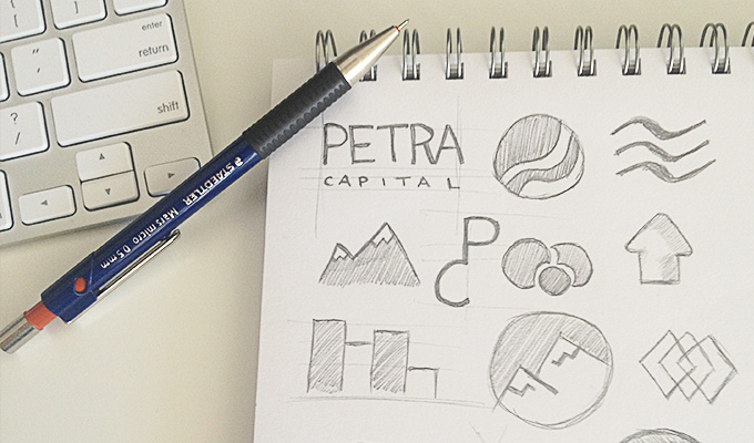
Your branding and company logo design is the face of your business, and as such you need to ensure that you work with a reputable logo designer. Having designed over 1500 logos for businesses since 2006, our reputation has been built on quality logo designs that are affordable. Our talented in-house corporate logo design team know the art and science of creating the perfect logo for you. Along with our unlimited design revisions where we design until you are 100% happy, exceptional customer service and the fact that all our designers are in-house, you know your logo will be in safe hands. For more information on our design services please click here. And be sure to read our 4 fundamentals of great logos below.
4 Fundamentals of Great Logos
1. Simplicity
The best company logo design simply and effectively conveys an emotion or idea without trying to say too much at once. Flat shapes, bold lines and clear type are hallmarks of simple logos that never run the risk of appearing busy or worse, confusing.
Occasionally, innocent enthusiasm leads business owners to want an elaborate logo design in an attempt to convey as much meaning as possible. Not only is this unnecessary, in many cases it’s a distraction. Your logo shouldn’t be a puzzle or poem, it should be an elegant icon to symbolise your organisation’s personality and values.
2. Versatility
Whatever size your logo is now, it might one day be as big as a billboard or as small as a postage stamp. Icons and fonts should be balanced and readable at any size and in a variety of contexts. Will your logo still be clear and effective if it appears in a single colour or on a black background instead of a white? The best logo designers consider these factors and plan ahead. A business logo designer will also supply you with a style guide which provides the best way for using your logo on different pieces of content across various channels.
3. Relevancy
The best logo design centres around a single attribute that is relevant to your prospects and your industry. Does it emphasise power, agility, connectivity or innovation? The message should be relevant and resonant to your audience. A childcare centre would likely choose a logo that is colourful and fun while a law firm should consider a traditional logo with a confident colour scheme. This may seem obvious, but it’s worth emphasising because it is critical to your brand image.
Relevant also means your logo should be aligned to your business objectives, rather than your personal taste. Avoid unnecessary elements that may be visually pleasing but don’t support your message.
4. Artistry
Ultimately a great logo is like a piece of art. Like all great art, it can instantly evoke feelings of joy, gratitude, anticipation or calm. It combines colour, font, layout, and graphic elements into a visual that can communicate in a single glance the passion and integrity behind your business. It takes real artistic talent to arrange these elements for maximum impact and influence. In our experience this is where logo design most often fails.
The aesthetic elements of the best logo design can be broken into four distinct categories. By evaluating a logo through each of these viewpoints it becomes easier to move the design of a logo into its ideal finished product.
Font
Some of the best logo designs are little more than a business name written in the perfect font. The right font for your logo will clearly articulate your brand identity, with or without additional graphic elements. Well-crafted fonts in themselves are works of art often underestimated, but a well-chosen font can bring a brand to life.
Colour
Colours play an important role in how people perceive your brand. They can be emotionally and culturally significant depending on factors including region, age and gender. In most cases what works is to have one or two at most main colours and then have a complementary neutral colour like very light grey, charcoal or beige.
Layout
Are all the special elements of the logo in balance? The icon, the text of your business name, and any sub text that is being used all need to be sized and positioned by your logo designer in a way that makes the final product a unified entity.
Icon
It is true that a well-executed custom logo design can take a simple icon from effective to exceptional. However, it isn’t always necessary to have an icon and sometimes the most effective icons are very simple.
By breaking down the logo design into its components, both conceptually and visually, it will put you in a confident mindset to create and recognise a logo that is the perfect representation of your business. If you’d like to discover more examples of some great logos, click here to see our work.
