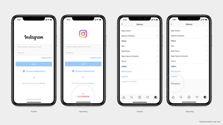
Facebook has unveiled a new company brand, featuring a capitalized wordmark, bespoke typeface and a flexible color palette that changes depending on its environment. Created with assistance from UK-based type foundry Dalton Maag and agency Saffron, the new brand identity aims to distinguish the company from the app, which will retain its current logo and branding.
The decision to rebrand follows a move from Facebook to be more visible about its ownership of other apps like WhatsApp, Oculus, Instagram, and Portal, recently introducing the “from Facebook” tagline to the products it owns. The brand identity will be introduced across these apps in the coming weeks, as well as to a new company website, which will launch on 12 November. Speaking to It’s Nice That, Facebook’s head of design Luke Woods says, “When folks hear the word Facebook, they immediately think about Facebook the app. They don’t find the connection to all of the other products and services that are part of the larger Facebook company. And that’s really what we’re trying to solve here.”
Starting at the beginning of 2019, Facebook brought together a team from across different areas of the business to work on the rebrand. Working iteratively in similar way to how Facebook prototypes digital products, the process first involved talking to Facebook employees, app users and businesses that use the platform about their perception of the brand, before devising three “design behaviours” that the new brand needed to embody: clarity (to simplify and build understanding), empathy (to respect context and environment) and creating space (to support users’ stories).
The team also enlisted UK-based type foundry Dalton Maag and agency Saffron to collaborate on the project. Facebook creative director Zach Stubenvoll tells us, “Part of that decision was that we wanted an international perspective as we’re looking at [the brand] internally and externally. Having Dalton Maag and Saffron’s perspectives were very helpful to keep us moving quickly in this process and understand we’re building a brand for a global audience.”
One of the key design decisions was to create a new brand that felt immediately different from the existing Facebook branding. Woods says, “We looked at the Facebook core visual assets, its word mark and approach to typography. They’re lowercase letters, very condensed, vertically proportioned letterforms, with sharp edges. We thought about what tools we have as designers to draw a distinction.”
In opposition to the current app brand, the new logo features capitalized letters, with wide letterforms, rounder corners, and open spacing. Special attention was paid to the proportion of the letterforms. Woods says, “Typically typefaces with classical proportions have much a narrower character for an ‘F’, ‘B’ or ‘E’, while characters like a ‘C’ and ‘O’ would take up a full square proportion. So we looked at a proportion that was a little bit evener character to character. We also looked for opportunities to bring some uniqueness into the typeface. Probably the most unique aspect is the bowed or curved diagonal lines that you see primarily and characters like the ‘A’ and the ‘K’. We wanted to provide an opportunity for more personality with capital letters that could otherwise feel a little bit more rigid.”
At odds with the Facebook app’s instantly recognizable blue, the new wordmark does not have a fixed colorway and will adapt to the app in which it is being used. To complement this, Facebook opted for low-contrast letterforms, where the weight of the stroke is very even throughout different parts of the character. Woods explains, “Having a bolder or heavier weight than you might typically expect for all capitals gives us a surface on which we can place the vibrant and iconic colors from our app and consumer product brands.”
It was also integral that the new branding sat comfortably within Facebook’s suite of other apps. Woods says, “We want this company identity to have a connection to all of our product brands and their visual language so you get a little bit of the horizontal of Oculus and the pure geometry and softer radius from Instagram and Messenger. It was interesting to have this diverse ecosystem of visual elements to work with and to try to create something that can have a good level of harmony and contrasts with each of those distinct product brands that people are already familiar with.”
In some environments the new wordmark will be animated, using tracking and fade. As well as the custom wordmark, Facebook has also introduced a new people-centric approach to art direction, which Stubenvoll says is intended to reflect “openness”, “positivity” and “emotive moments”. Stubenvoll adds, “The art direction was inspired by the communities and people who use our technologies every day. Through casting and research, we found people who are using Oculus or WhatsApp or any of the other technologies in really beautiful ways to build community, to have a closer connection or to empower you themselves and others, create change in their communities.”
The rebrand follows a testing time for Facebook after Mark Zuckerberg’s Congress grilling in October about the company’s decision not to take down political ads including false statements, and its newly open-to-all Spark AR platform meeting some controversy over its mental wellbeing implications.

www.daltonmaag.com
saffron-consultants.com
