Helvetica is one of the most well-known and oft-used typefaces, and it just got a big refresh. Even if you’re not familiar with the font, you’ve definitely seen it — it’s used for everything from brand logos to books and magazines to the print on labels. It’s the official typeface of New York City’s subway system, and if you’re reading this on The Verge, you’re mostly reading stories constructed of Helvetica right now. It’s that wide array of uses that partly inspired Monotype, the oldest type company in the world and the one that currently holds the rights to Helvetica, to update the storied font for the 21st century.
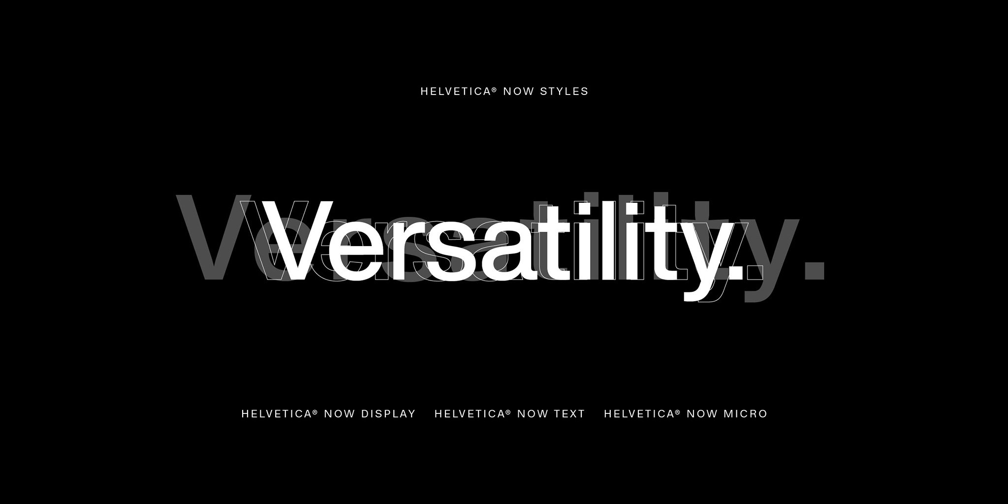
The new version is called Helvetica Now. It’s a tremendous overhaul that saw Monotype redraw every single one of Helvetica’s nearly 40,000 characters to be easier and more enjoyable to read, with a particular emphasis on going small: the kind of text you see a lot more of these days on your smartphone or pill bottle.
To learn more about what’s different and new in Helvetica Now, I spoke with Charles Nix, the type director at Monotype.
This interview has been edited for clarity and brevity.
So what is Helvetica Now? Can you tell us a little bit about how it differs from Helvetica and Helvetica Neue?
Why don’t we start with the “In the beginning” kind of story.
Sure!
Four years ago, our German office kicking around the idea of creating a new version of Helvetica. They had identified a short laundry list of things that would be better. We looked at the waypoints in the Helvetica design process, going back to 1957 when it was first born. All of the sizes of Helvetica early on were physically cut for specific optical sizes. So if you had 6pt type, it was cut to be 6pt type. And if you had 72pt type, it was cut to be 72pt type. When we went digital, a lot of that nuance of optical sizing sort of washed away.
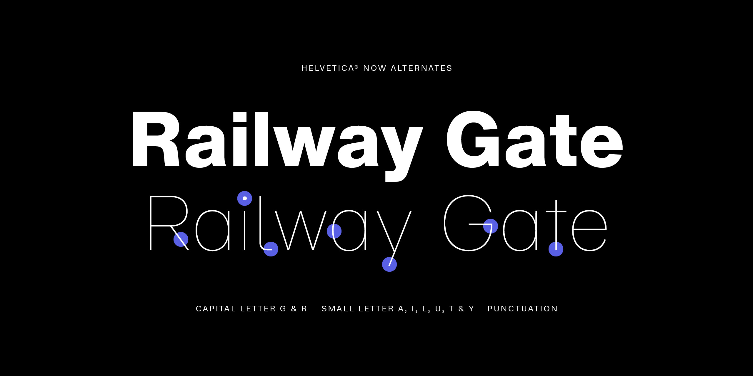
Also throughout the first 30 years a lot of variant forms — straight-legged “R,” single-story “a,” rounded punctuation, these sort of alternate characters — were built into the typeface and abandoned by the time it moved into the digital realm. So we wanted to build some of that flavor back into the typeface, that kind of variability. We reintroduced the straight-legged capital “R,” single-story lowercase “a,” lowercase “u” without a trailing serif, a lowercase “t” without a tailing stroke on the bottom right, a beardless “g,” some rounded punctuation. They allow users to modulate a feeling of Helvetica, in a way that was lost after the first 30 years.
“I WOULD SHRUG. ‘DOES THERE NEED TO BE A NEW HELVETICA?’ BUT THEN WHEN YOU SEE IT AND YOU USE IT … IT’S LIKE BEING REINTRODUCED TO AN OLD FRIEND”
I want to be clear, Helvetica is a great typeface, it’s just that it exists in a single master. It’s very rugged, it works fine, but Helvetica Now was born out of this idea that we could make a new and better Helvetica by returning some of the things that had existed before, and also incorporating some of the lessons we had learned about how people have used Helvetica.
If I had to put them in order of what we wanted to change, the first thing — from the customer’s point of view, the user’s point of view, the designer’s point of view — are those alternate characters because they’re the most visible change. The second most important thing to us and to designers is the optical sizing. It’s super important to me because it’s just, it’s one of those things when you say a new Helvetica, I mean, I would shrug. “Does there need to be a new Helvetica?” But then when you see it and you use it, because of the optical sizing, it’s like being reintroduced to an old friend. It’s amazing. I thought I knew Helvetica. I thought I didn’t need Helvetica. And then I see this Helvetica Now and I suddenly realize that’s it not what I thought it was.
How do you even approach creating a new version of Helvetica, when it’s such a well-known standard?
The most popular typeface in the history of the world, how do you approach redesigning it? Well, with extreme trepidation. [laughter] Better not mess this up! Of course, I’m not going to mess it up, but realize how much front end loading you have to do: Get deep into the forms, study the history, look at every iteration between 1957 and now, understand how it’s evolved and where the missteps happened — what can be corrected and what needs to be preserved.
It’s like the Hippocratic oath: “Do no harm.” Simplicity, clarity, neutrality, let that be the sort of mantra you keep repeating as you make every form. If you’re making any changes, make sure the variation serves that mantra. My part in the whole process was the micros, the sort of crazy 6pt, 5pt, 4pt or ultra-small pixel count typefaces, and the text typefaces.
“CAN I MAKE THIS CLEARER AT 3PT ON A RETINA DISPLAY OR ON A SUPER HIGH-RES PRINT?”
It was a lot of fun, and a lot of looking at early Helvetica printing, like 1957-1960 6pt Helvetica in metal, you know, on paper from Switzerland and from Germany, and studying the space between the characters. Only at the last minute, after I got that right, did I go back and change the actual letterform. The visual adjustments are very noticeable when you blow them up. If you look at the “F” and you see this pinch, or the lower case “t” — all of that was born out of “Can I make this clearer at 3pt on a Retina Display or on a super high-res print?” I think these letters appear even more like Helvetica at those ultra-small sizes.
There are moments in your life when you suddenly understand the concept of joy. I don’t mean to be overly dramatic about it, but the first proof that we pulled off Helvetica Now micro was one of those moments of my life. Like “Oh my god, the theory is true.” Every hypothesis we had about how a micro type could be made more legible, how it could preserve the impression of Helvetica, it played out.
And I just remember reading 3pt and 4pt type and thinking it’s a marvel because Helvetica always died at 6pt for me. It died at 7pt or 8pt because of the closed apertures, because of the cramped forms and tight spacing. Having it suddenly be incredibly legible at 3pt is one of those moments where the skies open up and the angels sing. There really was a broad smile on my face.
Is there a specific character that you’re most proud of?
The micro pound sterling mark for British currency. I was at a baseball game with a friend of mine, who’s also a designer, who said that a friend of his describes art in terms of something being done better than it needed to be. I spent an inordinate amount of time making the sterling work really well at 3pt and maintain its quality. When you look at it, it’s like an impressionist painting of the form.
There were moments with a lot of the micro currencies where I cut out some of the vertical bars, like in the yen symbol, the micro euro symbol, in order to get it to read really well at tiny, tiny type or in a low-res environment on-screen. When I hear myself saying that, it sounds like sacrilege, but it’s in the spirit of simplicity, clarity, and neutrality. It’s not like I took liberties: I saw what it needed in order to be more legible and I went with it.
You took an oath! You had to do it. [laughter]
Did you ever imagine you’d be working on a project to update Helvetica?
No. I used Helvetica a lot, but that was before 1990, when I was a young adult. I had a mentor, George Sadek, at the Cooper Union, who was obsessed with Helvetica. He was thinking of Helvetica in terms of Helvetica for the Linotronic 330, or Helvetica for metal, the same thing that Massimo Vignelli fell in love with when he saw Helvetica. Massimo told the story of seeing Helvetica and being so impressed he bought some to stick in the boot of his car. George Sadek had that love affair with Helvetica. It was the neutral voice of mid-century modernism.
“MY FIRST REACTION WAS ‘I WOULD NEVER USE THAT TYPEFACE; YES, I WANT TO BE INVOLVED.’”
And after Helvetica Neue came out and we incorporated desktop publishing into digital workflows with PageMaker, QuarkXPress, and eventually InDesign, Helvetica fell out of paper with me. Part of that was “you don’t follow the religion of your elders,” you know, the natural desire to reject everything that you learn in order to find something new. The other part was that I wasn’t getting out of Helvetica what I saw before. It wasn’t the same thing. The world was gigantic and I wanted to use other typefaces.
This is all by way of saying that when Tom Rickner approached me last year about working on Helvetica Now, my first reaction was “I would never use that typeface; yes, I want to be involved.” I utterly and completely and deeply wanted to be involved with this for all the reasons I rejected it. Because I felt like there was something more there. I was so excited to be tapped to be part of a team that would put that animating spirit back into it.
Do you think we’ll have to wait another 30 to 50 years for an updated Helvetica?
If we did our job right, yes. Hans Eduard Meier and Eduard Hoffmann introduced Helvetica in 1957, and then, almost immediately after, they started augmenting the family. Do a text weight; do a lightweight; do a bold weight — meaning extra bold — do a black weight; do the italics. So these things got rolled out relatively quickly, considering the amount of work involved.
Then the width axis starts to get filled out: Helvetica Condensed and Helvetica Expanded. I feel that’s the next stage for this project, in my mind. I’m not the whole company, I’m just a type director, but my two cents is to say that rather than waiting 30 years for a new Helvetica, it should only be a year or two to get the width axis filled out.
“WE OBSESS ABOUT THE BISON, ABOUT THE ZEBRA … MEANWHILE, THE MAJORITY OF ALL THE ANIMALS IN THE WORLD ARE SMALLER THAN OUR THUMBS.”
I divide the world of typographic between display typeface and text typeface, and the display typefaces are like the charismatic megafauna of the world. We obsess about the bison, about the zebra or the giraffe. Meanwhile, the majority of all the animals in the world are smaller than our thumbs. We obsess about display typography, but most of the type setting in the world is done on the text level. And then there’s an even more massive amount of typesetting on the micro level, like everything on pill bottles to wordings within the subsections of your tax code. There’s a lot of microtype out there. I feel like Helvetica Now Condensed and Expanded in that environment are going to offer an incredible design tool.
Could you ever imagine Helvetica as a variable font, (a single font file that allows infinite flexibility of weight, width, and other attributes without also gaining file size)?
Yeah, definitely. I mean, that’s what I want. When you’re setting captions on the web, imagine if you were able to dial in the perfect weight for it. Naturally we need micro, but can I have it just a smidge lighter? That’s the world that we all want to live in. Or better, programming behaviors that let CSS go ahead and do the work for you.
I mean, we’re not far from that.
Update April 9th, 5:30PM ET: Nix corrected his earlier statement to reflect that he was not employed by Monotype at the time the German office was kicking around a new version of Helvetica
Source: theverge


