Started by a young entrepreneur in 1971, FedEx was once just a tiny delivery company. Now delivering millions of packages every year, FedEx has grown to become a powerhouse in the world of home delivery. Delivering packages for every holiday or sale imaginable, this Fortune 500 Company is showing no signs of slowing down.
One factor that has always worked in the favor of this company is the distinctive look of their logo. People from across the world are sure to see the logo on a truck going past or delivering a much-anticipated package to their door. This kind of brand recognition is incredibly important for any company. It ensures that people are being exposed to it on the roads or when they are happily anticipating a package. This in turn creates a positive reinforcement of the power of the FedEx brand. Anyone who seeks to create their own branding empire should, in turn, consider the history of the famous FedEx Logo.

Logo#1-Federal Express
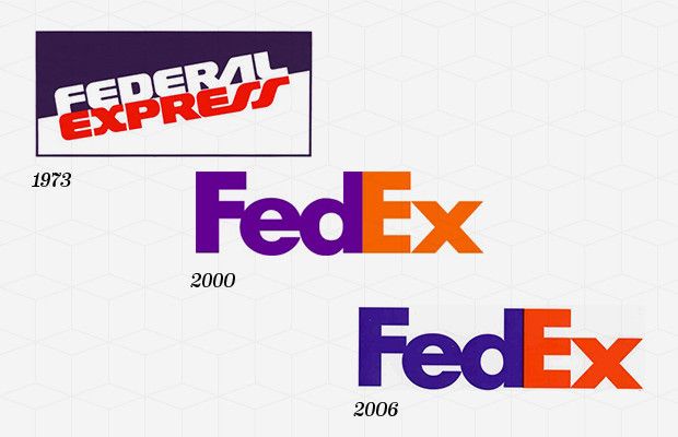
The first FedEx logo, which was created in 1971, actually went by the full name of Federal Express. This logo showed the words “Federal Express” at a slant. Each word is in a different colored area of the logo. The main reason for the name “Federal Express” was t associate the company with the U.S. Government. This meant that Federal Express enticed employees from the both the US government and the civilian population. This helped Federal Express to catapult itself to the top of the delivery world.
Logo#2-The Hidden Symbol
In 1994 the current logo of FedEx was created. This logo featured only the words FedEx which, though it seems simplistic, actually has some depth to it. First off, the logo is rather famous for the optical illusion hidden within it. If someone looks closely at the space between the E and the X a person will notice a small arrow hidden there. This arrow served to symbolize FedEx’s speed and accuracy. There is also an important meaning in the colors of the “Ex.” Whatever color the Ex is differentiates between the different parts of the company. As an example an orange “Ex” stands for FedEx express, while a red “Ex” stands for FedEx Freight. In this way FedEx is able to cleverly separate the individual businesses from within the whole of FedEx. So, as can be seen, FedEx has managed to pack quite a bit of information and symbolism into a clean and simple logo.

Why the Logo Works
The FedEx logo manages to work on a number of levels. Its first logo sought, and succeeded, in capturing a lot of government work. This made a huge difference in the profits of the company, propelling them to the top. They then followed up on that success by introducing a very clever logo that had quite a bit of hidden depth within in.
Also, FedEx has worked hard to become an international presence increasing their brand awareness across the world. This, in turn, has helped them to thrive in both the U.S. and overseas creating a very powerful and profitable company.
