Most people remember the criticism the 2012 London Olympics logo received, at £400k it was something of a controversial investment. There have been other notable big rebranding spends, such as the BBC and BP, although it is worth considering that figures in the media often include changing signage, stationary and other branded assets, it isn’t all spent on a snazzy design.
Companies repeatedly spend hundreds of thousands on external agencies who research, test and create a new logo for them. But what are they actually doing? Is all that talk of ‘complexity’ and ‘representativeness’ really relevant?
Well… yes, it would appear so.
Over the years, the subject of company logos design has been the topic of scholarly research. These studies have looked at the logo from different perspectives, from the level of detail in a design to the old debate of masculine/feminine characteristics.
One study looked at the significance of using a symbol or just the company name as a logo. The study revealed that using a symbol within a logo was more effective in providing consumers with the ability to identify with the brand, as they could use this as a form of self-expression, than when the logo was just the company name.
So the Nokia logo would be less effective than the Apple logo for example. Although Apple use additional text names for different product categories alongside the symbol, the same apple appears across the range and is an iconic design.


The rest of the research looks at the makeup of the symbol itself, a starting point for which should be it’s meaning. A logo should reflect the brands ‘symbolic and functional benefits, as this allows consumers to better relate to the brand. The logo is a key tool in the communication of a companies meaning and what they stand for. Natural shapes are the most effective but this needs to reflect the principles, ethos or industry that the company operates in.
The Microsoft logo is a good example of representative logo design (and it didn’t cost the earth) as this uses a window like shape, as though there are four panes of glass, in different primary colours.

Colour in logos is a complex issue as the meaning of colour varies depending on the cultural perspective of the viewer. One study found that green could mean envy, reliability, love or disease depending on the country and culture in question.
Even in Anglo-Saxon groups, red can mean love or anger so it is easy for colour to be a complex element when designing a logo. In terms of colour’s influence on the perception of masculinity and femininity, there was found to be little separation. So if your product or service is equally appealing to both sexes but your company is not international, the colour pallet you select is less of a factor.
Aesthetic appeal is integral to strengthening brand commitment with consumers. No surprises there! But there are further guidelines you can use to influence your ideas. How complex the design is can have a significant impact on the logo’s performance over time.


Having a simple logo, like Mitsubishi, would understandably achieve faster recognition than a complex logo like Porsche. It may take a few times to commit a more complex logo to memory, but with repeated exposure, it will receive a continued growth in positive brand attitude from consumers. A simple logo, however, stays relatively static in the level or brand recognition it achieves over a period of time, so for pop-up shops, fashion trends or seasonal businesses, a simple logo would be far more appropriate.
The shape and form within the design were found to have an impact on how masculine or feminine the brand were perceived to be. One study found that bold angular shapes increase brand masculinity perceptions where as slender, round shapes enhanced perceptions of femininity in a brand.
This is becoming increasingly controversial as the lines between genders become fuzzier. The two terms can now be thought of as being on opposite ends of a spectrum, as individuals express themselves freely and engage in activities historically judged as being appropriate for the opposite sex.
But as any marketer knows, the principle is to target your primary customer base, rather than a catchall approach. If your product could be used by anyone but has a tendency to be purchased or consumed by a particular gender, then this is worth considering.
Two extreme examples would be the previous Black & Decker logo and Pampers. As a woman, I own a drill and have never bought nappies, but I understand the principle behind the logo design.


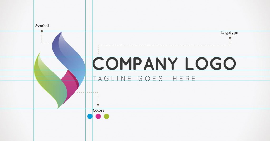
This principle extends to the font chosen, as you can see above, fonts that have a soft curvy style are considered to be more feminine and vice versa for bold, square fonts. Bare in mind that the test was carried out on fictitious brands, so there was no connection to existing product categories.
So the key elements you should consider for your logo design, according to the research, are as follows:
| Contents | Symbols increase brand awareness over names |
| Meaning | Represent symbolic or functional brand benefits |
| Colour | Consider cultural sensitivities |
| Depth | Simple design for faster recognition, complex design for longevity |
| Form | Angular, bold shapes for masculinity, round, slender shapes for femininity |
You can use this as a starting point for collecting information for an organisation that are considering a re-brand. Think about the target audience now and how this may develop in the future. This is especially true if international markets are on the horizon.
